- April 10, 2025
- 0 Comments
- By Admin
The Art of Dark Mode Design: More Than Just a Trend
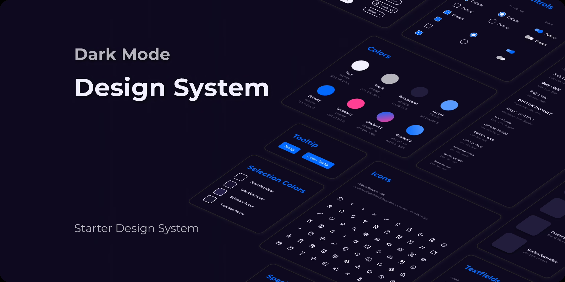
Dark mode isn’t just a passing aesthetic choice anymore — it’s an expectation. From mobile apps to desktop software, and even entire operating systems, users are embracing dark interfaces for their elegance, energy efficiency, and eye comfort. But designing for dark mode is not as simple as inverting colors. It’s an art and a science.
Let’s explore why dark mode matters and how to design it well.
Why Dark Mode?
Before we jump into design principles, it helps to understand why dark mode is so popular:
- Visual Comfort
Dark backgrounds reduce eye strain in low-light environments, making it easier to consume content without fatigue. - Battery Efficiency
On OLED and AMOLED screens, black pixels are essentially “off,” which can help conserve battery life. - Aesthetic Appeal
Dark themes often feel sleek, modern, and immersive. They allow vivid colors and visual elements to pop beautifully. - Accessibility & Preference
Some users with light sensitivity or visual impairments find dark mode much more usable. Others just prefer it. Offering both modes respects user choice.
Core Principles of Dark Mode Design
1. Don’t Just Invert Colors
Simply flipping light to dark can lead to unpleasant contrasts and readability issues. Instead, design a dedicated color palette that feels natural and balanced in dark mode.
Pro tip: Use desaturated and muted tones rather than bright colors. Neon colors can feel harsh against dark backgrounds.
2. Focus on Contrast — But Not Too Much
High contrast is crucial for readability, but too much can be jarring. Aim for a comfortable contrast ratio (WCAG recommends at least 4.5:1 for body text).
Avoid pure white text (#FFFFFF) on pure black (#000000) backgrounds — it can create a “halo” effect and strain the eyes.
3. Elevation and Depth
Use subtle shadows, gradients, and layer effects to create depth. In dark mode, elements can easily blur together, so clear visual hierarchy is key.
Tip: Elevation in dark mode relies more on brightness than shadow. Brighter surfaces appear closer to the user.
4. Use Color Sparingly for Accents
Color in dark mode should be used purposefully. Highlight important actions, links, and notifications with accent colors that stand out against dark backgrounds without overwhelming the user.
5. Test in Multiple Lighting Conditions
A dark mode design might look great in a dim room but too dull in bright daylight. Test your designs across environments and devices to ensure consistency.
Common Mistakes to Avoid
- Forgetting About Images and Illustrations
Make sure images have transparent backgrounds or appropriate contrast adjustments. Light illustrations may vanish on a dark background. - Neglecting Accessibility
Always check for color blindness compatibility and contrast ratios. Tools like Stark or the WCAG Contrast Checker are invaluable. - Inconsistent Themes
Ensure your dark mode is consistent across the entire app or site. An unexpected bright section can break immersion.
Tools and Resources
- Figma & Adobe XD — Both support dark mode design workflows.
- Material Design Guidelines for Dark Theme — Google’s design system has excellent dark mode documentation.
- Accessible Palette Tools — Tools like “Accessible Colors” help you build color sets with optimal contrast.


Leave a comment