- April 7, 2025
- 0 Comments
- By Admin
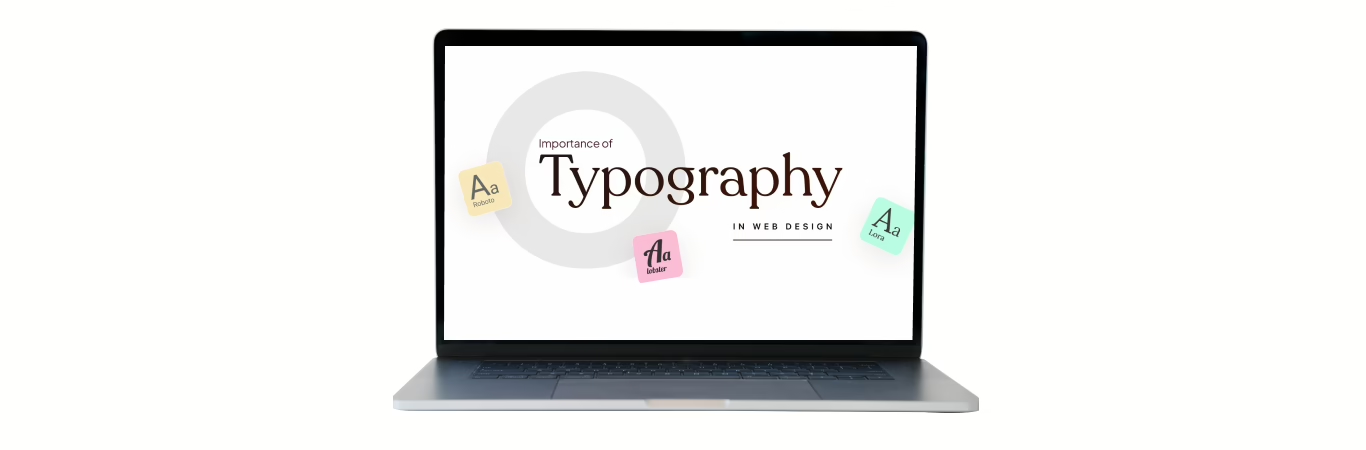
Great choice! Typography is a huge part of web design — honestly, even if your layout is simple, good typography can make your site feel professional and polished. Let’s break it down clearly.
🌟 What Is Typography in Web Design?
Typography is how you style and arrange text on your website to make it readable, attractive, and effective at communicating your message.
It’s not just about choosing a pretty font — it’s about:
- Readability
- Hierarchy
- Visual harmony
- Brand personality
🔑 Key Elements of Typography
Font Selection (Typeface & Font Family)
- Serif fonts (like Times New Roman) feel more traditional and formal.
- Sans-serif fonts (like Helvetica, Arial, Roboto) feel modern and clean.
- Display fonts are decorative — best for headlines, not body text.
- Pro tip: Limit to 2–3 fonts on a site to keep it cohesive.
Font Size & Scale
- Establish a clear hierarchy (H1, H2, paragraph text, etc.).
- Use modular scale for proportionate sizes (e.g., base size 16px, headings scale up like 24px, 32px, etc.).
Line Height (Leading)
- Good line spacing improves readability.
- A general rule: 1.4 to 1.6x the font size for body text.
Letter Spacing (Tracking) & Kerning
- Small adjustments to space between letters can improve readability or create visual interest.
Line Length
- Aim for 50–75 characters per line for optimal readability.
Contrast
- Make sure text contrasts well with the background.
- Avoid light gray on white or dark gray on black unless you increase font weight.
Responsive Typography
- Text should scale well on different devices.
- Use relative units like
em,rem,%instead of fixedpx.
Text Alignment
- Left-aligned is most common for readability.
- Center-aligned works for headings or short blocks of text.
- Avoid fully justified text on web (it can cause uneven spacing).
🎨 Typography & Brand Personality
Typography plays a huge role in setting the tone of your website:
- Fun and playful brand? Maybe use rounded sans-serif fonts.
- Serious, professional service? Go with clean, sharp serif or sans-serif fonts.
- Luxury brand? Think elegant serif fonts with high contrast and spacious layouts.
💡 Tools & Resources
- Google Fonts — free and web-safe fonts.
- Adobe Fonts — premium font library.
- Type Scale Calculator — helps set up a harmonious font scale.
- Fontjoy — helps you pair fonts nicely.
🔥 Pro Tip
Even if you use only one great font family with different weights (Light, Regular, Bold), you can build an entire beautiful design. Less is often more!


Leave a comment